Project Overview
This project showcases my work in 3D asset creation, technical art, and production workflows.
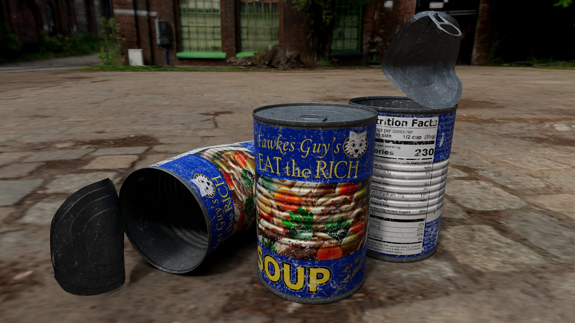
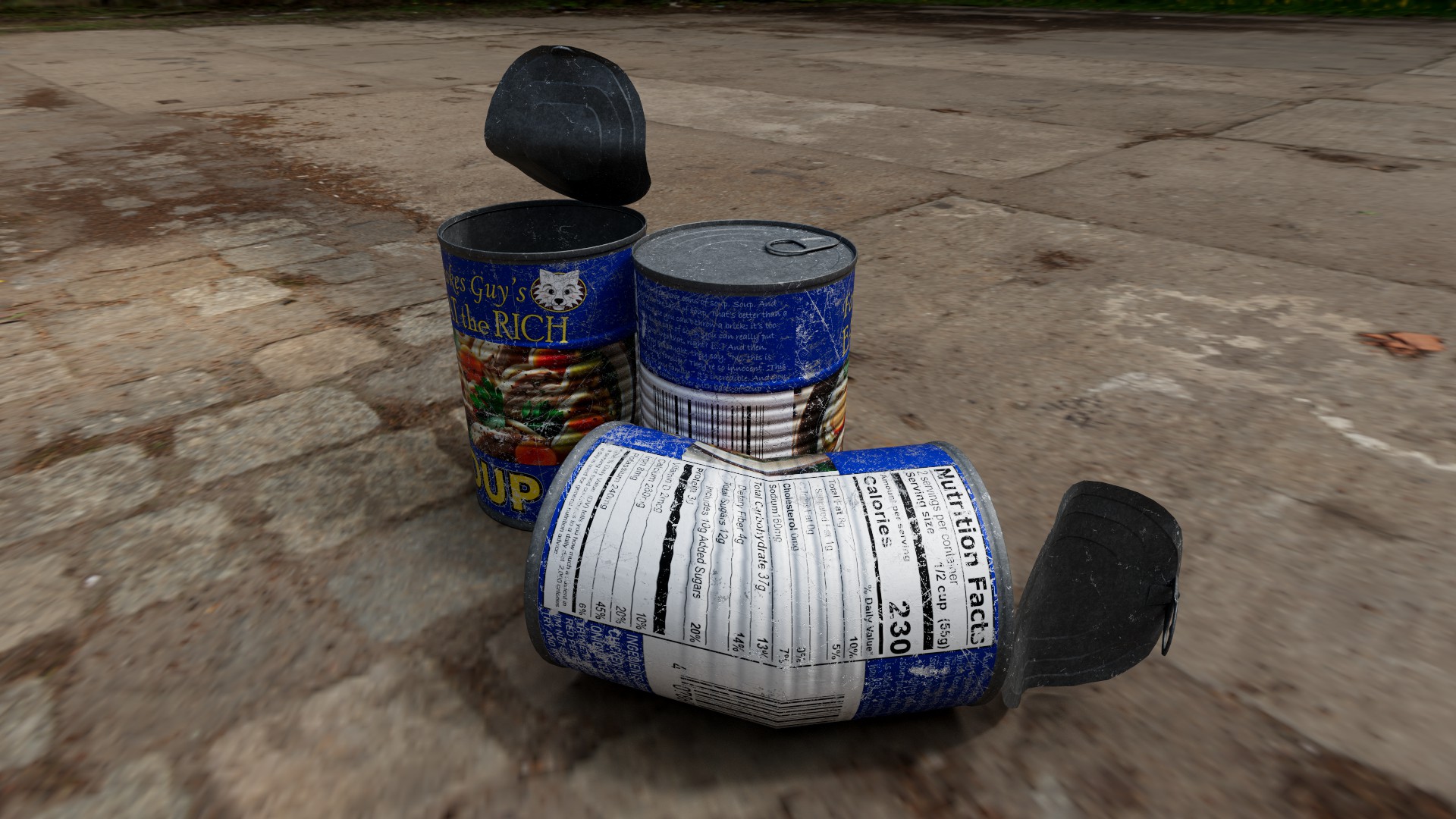
The Tin Soup Can project is one of my favorite examples of how a simple object can become a vehicle for commentary, humor, and technical exploration. When I created this piece, I wanted to take something completely ordinary — a soup can — and elevate it into a stylized, satirical prop that feels both familiar and slightly provocative. The label, “Eat the Rich Soup,” is intentionally tongue‑in‑cheek. It’s a playful nod to pop‑art traditions and cultural commentary, but the real heart of the project lies in the craftsmanship behind the model itself.
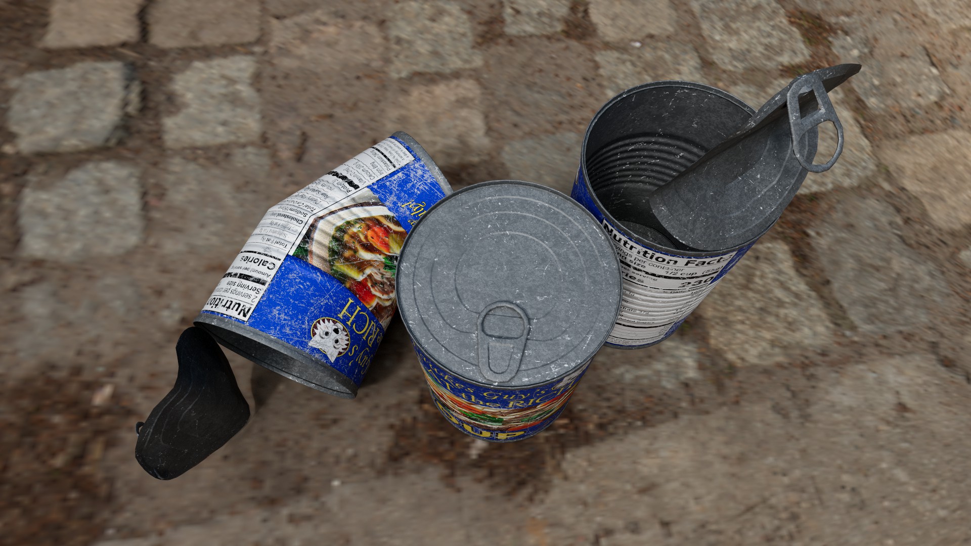
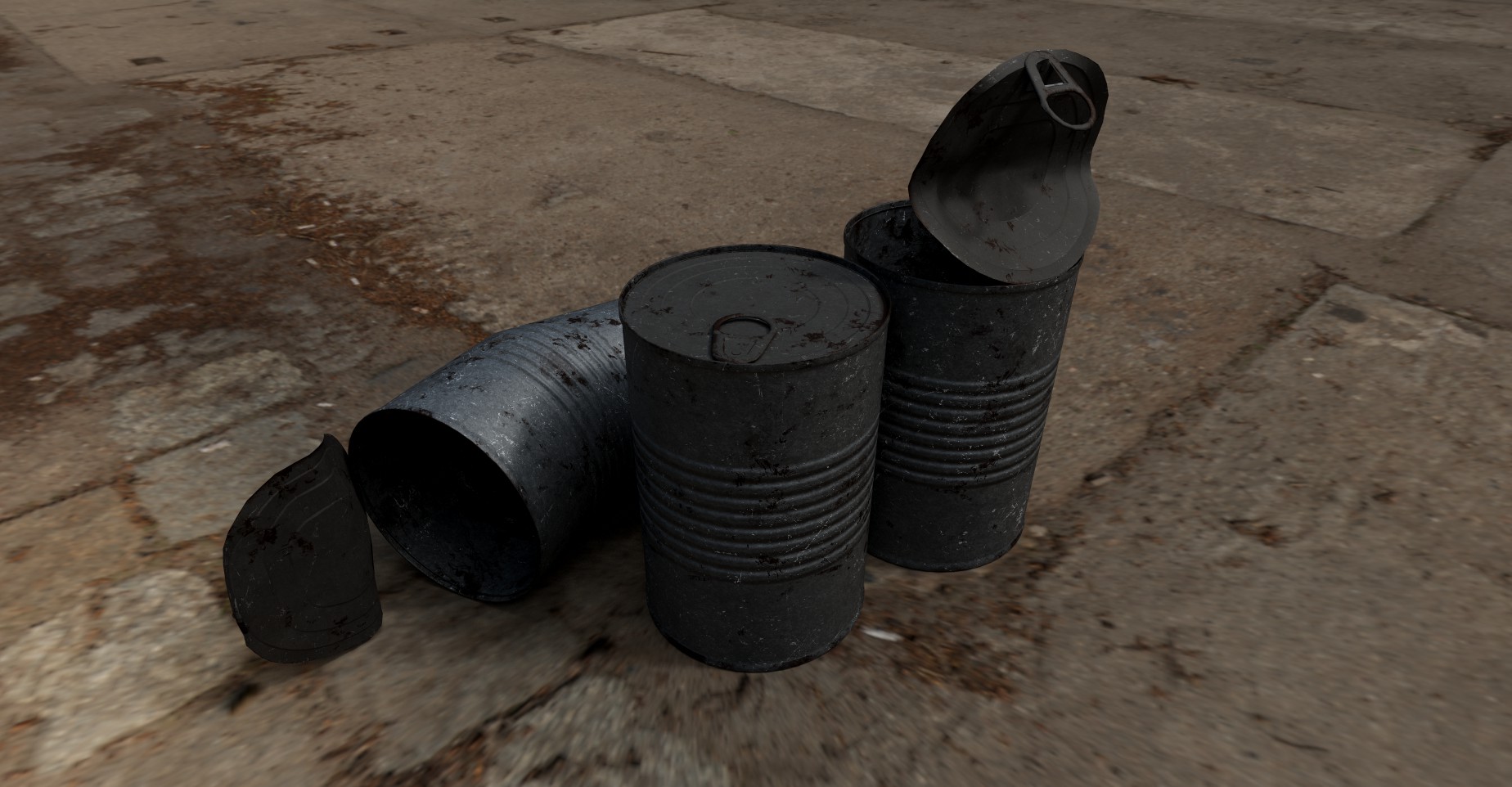
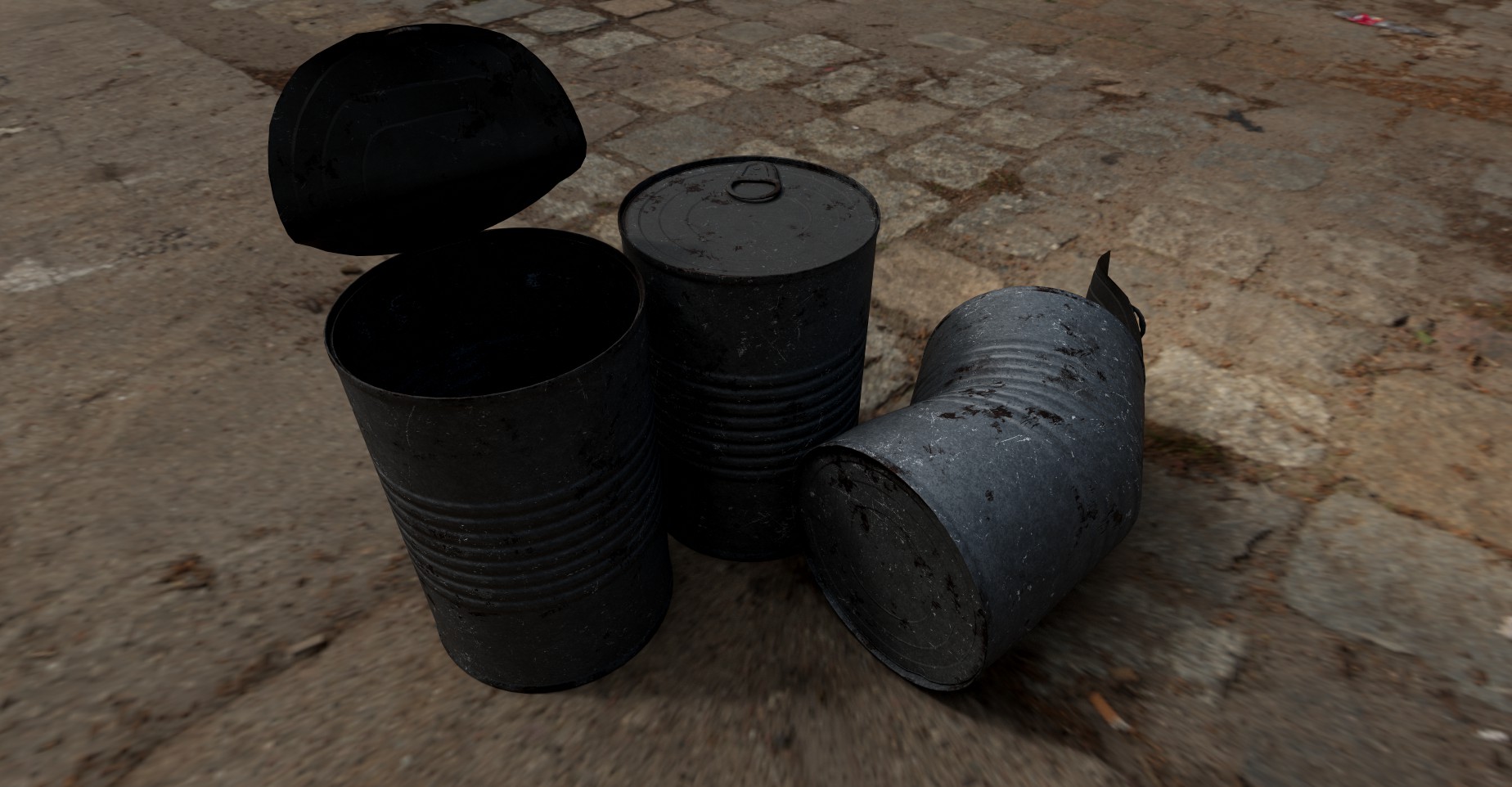
I approached the can as if it were a hero prop, something that needed to hold up under close inspection. Even though the object is small and simple in real life, I wanted the digital version to feel tactile and believable. I started by modeling the can with clean, efficient topology, paying attention to the subtle dents, rim curvature, and metal deformation that give real cans their character. These imperfections are important — they make the object feel used, handled, and grounded in reality rather than looking like a sterile CAD model.
Once the model was complete, I moved into texturing, which is where the personality of the piece really comes through. The label design was intentionally bold and graphic, using flat colors and simple shapes to mimic the visual language of mass‑produced canned goods. I wanted it to feel like something you might actually find on a grocery store shelf, but with a twist that makes you look twice. The typography, color choices, and layout were all designed to strike a balance between humor and authenticity.
The metal material required a different kind of attention. Real tin cans have a mix of glossy and matte areas, with subtle roughness variations caused by manufacturing and handling. I used PBR workflows to create a surface that reacts realistically to light, including faint scratches, oxidation, and fingerprints. These details help sell the illusion that the can exists in a physical space, even though it’s entirely digital.
Lighting and rendering were just as important as the model and textures. I chose an outdoor environment for the final presentation because natural light brings out the richness of the materials and adds a sense of narrative. The ground surface, shadows, and reflections all contribute to the realism of the scene. The outdoor setting also creates a contrast between the polished, graphic label and the gritty, organic environment, which reinforces the satirical tone of the piece.
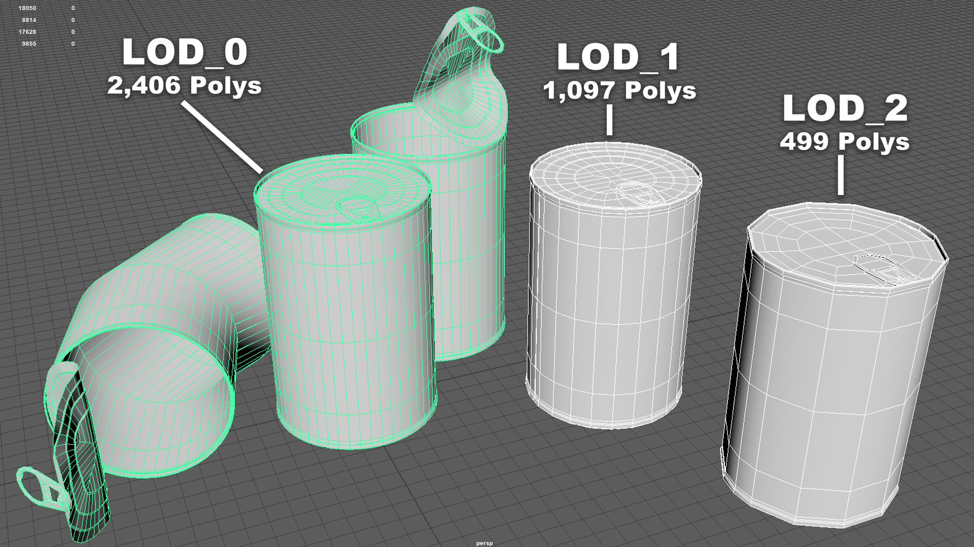
From a technical standpoint, the Tin Soup Can is fully game‑ready. The topology is optimized, the UVs are clean, and the textures are efficient without sacrificing detail. It could easily be dropped into a real‑time engine like Unreal or Unity, used as a prop in a cinematic, or included in a stylized environment. Even though the project is humorous, the underlying craftsmanship is serious — it reflects my commitment to creating assets that are both visually compelling and technically sound.
Ultimately, this project represents my interest in blending storytelling with technical execution. It’s a reminder that even the simplest objects can carry meaning, spark curiosity, or make someone smile. The Tin Soup Can is small, but it’s packed with personality, and it remains one of the most fun props I’ve created.
View all projects ·
Browse assets ·
Contact